How brands like Netflix and Spotify use data visualisation for social campaigns
Data does not always have to be a confusing chunk of numbers. Here's how brands use data visualization and data-informed product design to bring out data's creative side.
Data does not always have to be a confusing chunk of numbers. Here’s how brands use data visualization and data-informed product design to bring out data’s creative side.
Inspired by the agenda of a marketing conference I was recently invited to, I asked myself a rather random question: is big data actually still a thing?
My conclusion: yes, it is. And it also will be in the near future – only in a slightly different way. To be more precise, I believe that we will be seeing a lot more of data’s creative side.
What’s data’s creative side? The most obvious, and also most developed area in this regard is probably data-informed user experience (UX) design. But in my opinion, this is only the tip of the iceberg. There are (at least) two more areas of data-centric creativity that are growing at light speed and therefore are worth a closer look.
1. Data visualization – communicating data in an easy to digest manner
The visualization of data is often overlooked or deprioritized – especially here in Asia. If you’re guilty of doing so, here are two consumer-facing campaign examples that should put data visualization back on your radar.
In order to promote its TV show Narcos, which tells the story of Pablo Escobar and the Medellin cartel, Netflix created infographics that brought the economy of the Columbian cocaine trade to life in a socially engaging way.
Here are some examples showing how Netflix built a whole campaign around the Columbian cartel’s cocaine data using the hashtag #Cokenomics.
A dedicated twitter account @NarcosNetflix has almost 67,000 followers and posts regular tweets such as this one:
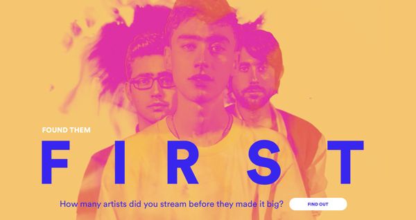
Spotify’sFound Them First gave music fans a way to prove that they were really into certain bands and singers before they actually became famous. Listening data was used to show users all the artists they had discovered ahead of other Spotify users.
Within weeks of the site’s campaign launch in October 2014, it had received more than 1 million visits and more than 100 million social media impressions, without any media spend.
Data Tools
In most cases, data doesn’t actually need to be communicated to customers directly, but to internal stakeholders. For such instances, there are several tools that can help you avoid the all-too-common walls of text with stock charts presentations, and substitute them with something a little more engaging and inspiring.
For example, if you are looking to beautify your charts, graphs, maps and timelines, make sure to check out the likes of RAW, Datawrapper, and Timeline JS. Should you have a little more time on your hands, and also know how to code, have a look at D3.js, which comes highly recommended by my team’s creative technologist.
And if you really want to up your data visualization game, you can take some inspiration from Hans Rosling, who is known for his unconventional ways of bringing subjects such as population growth and income equalities to life in a more tangible way.
2. Data-informed product design
Another space to watch is the one of data-informed product design. Now I’m not talking here about your typical research-initiated product innovation cycle. I’m talking about an evolution of data visualization that quite literally and directly translates data into an actual product.
Here are three of my favorite projects within this space, the likes of which I can’t wait to see more of.
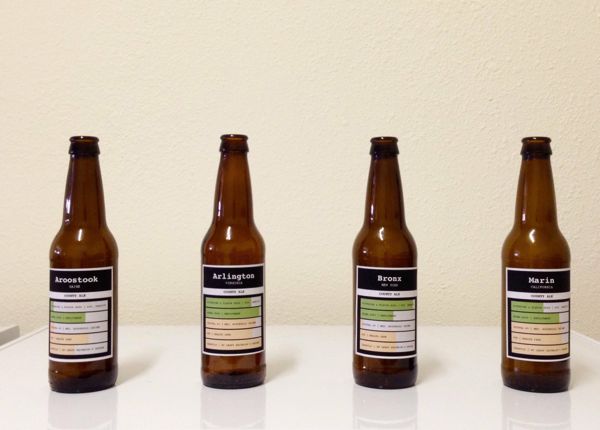
Flowing Data: Multivariate Beer
Nathan Yau from Flowingdata took U.S. demographics to brew four different types of beer.
For example, he mapped population density to the total amount of hops, and ethnicity to the type of hops used. See Flowingdata’s website for a more detailed description of the process and other ways it transforms data.
Tempescope
Tempescope was invented by Japanese software engineer Ken Kawamoto. It is a device that displays either current weather conditions or forecasts them physically.
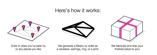
Meshu
Meshu is a concept that takes important life locations such as cities or even specific street addresses, maps the paths between them, and finally transforms them into a piece of jewelry.
The examples above show us there are no boundaries to data’s creativity – a lot of it however is still driven by artists, scientists, and entrepreneurs. My hope for the future is to see the marketing and advertising industry more strongly recognizing the beauty that lies within data and the compelling stories it can tell. Storytelling is after all, a major part of our jobs.
Streaming has become a staple of US media-viewing habits. Streaming video, however, still comes with a variety of pesky frustrations that viewers are ...
Winning the Data Game: Digital Analytics Tactics for Media Groups
5y
Winning the Data Game: Digital Analytics Tactics f...
Data is the lifeblood of so many companies today. You need more of it, all of which at higher quality, and all the meanwhile being compliant with data...
Learning to win the talent war: how digital marketing can develop its peopl...
2y
Learning to win the talent war: how digital market...
This report documents the findings of a Fireside chat held by ClickZ in the first quarter of 2022. It provides expert insight on how companies can ret...
Five ways data is transforming the brand-agency relationship
4y
Jacqueline Dooley
Five ways data is transforming the brand-agency re...
A new guide by data, analytics, and marketing services provider Data Axle profiles five use cases that demonstrate how agencies can use data to offer ...
Social Listening: New report uncovers missed opportunities for PR professio...
4y
Luke Richards
Social Listening: New report uncovers missed oppor...
A new report from Talkwalker highlights that PR today is increasingly digital and social. But there are many opportunities for marcomms professionals ...
The creative’s critical role in online-to-offline customer experiences
5y
Ashley Still
The creative’s critical role in online-to-offline ...
Adobe's VP of Creative Cloud talks about using data to drive empathy, design, and successful customer experience, when moving from a tactile brick-and...
Influencer marketing: The Good, the Bad, and the Ugly
7y
Marcela De Vivo
Influencer marketing: The Good, the Bad, and the U...
As simple as influencer marketing sounds, getting it right is time consuming and requires a lot of energy, effort, and attention to detail. Like anyth...
Data-driven attribution: the cure for discount code abuse?
7y
Chris Camps
Data-driven attribution: the cure for discount cod...
When measuring the effectiveness of discount codes, retailers often get it wrong. In this article, we'll look at how data-driven attribution can help ...